Week #2 in my 365-day art project was all about COLOR!
I’m really very excited because I feel like I learned a lot! You’ll see that I got a bit experimental too. Who knew I had it in me?!
NOTE: I decided instead of spamming you with tons of drawings in one post, I’ll use my blog posts to highlight the best of the week. If you’re interested in seeing the entire week’s progress, please feel free to check it out on my Tumblr. For some reason, I feel like it’s okay to spam people on Tumblr…but not you, dear readers!
I started off this week pretty normally, but by the end, I diverged quite a bit from what I’m used to.
~
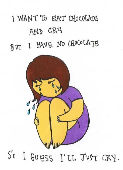
~Monday: Lola~
(Another drawing of Mika for his doodle contest!)

~
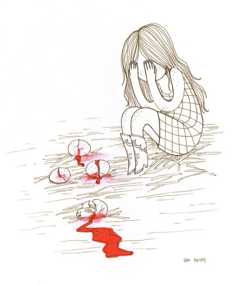
~Wednesday: A Study in Something~
Things are starting to get weird…
~
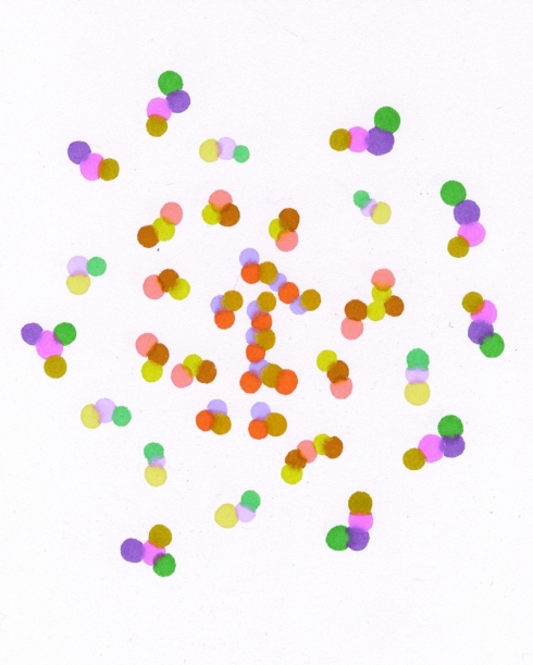
~Friday: Babel 121:~
By Friday I kinda felt like I was going mad with this new-found love of color. I felt like I needed to color everything and use everything in my power to do so. Yeah…two weeks in and I’m already going insane.
So, I decided to test out the watercolors my friend gave me for Christmas!
I’ve never really used watercolors before, so I didn’t wanna jump into a full piece just yet. Instead, I went with some warm up pieces to start. I saw this excellent idea a while back about making pixelated water color paintings, and I figured this would be the perfect time to try it out!
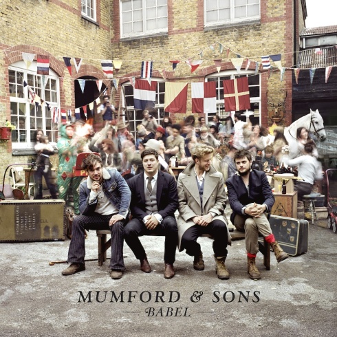
My first subject was the cover for Mumford & Sons’ album Babel. I swear I like their photos more than I like their music. Not that their music sucks or anything, but damn, they take a mighty fine photo.
Aren’t the colors in it just gorgeous?!
Annnd, here’s my pixel painting version!
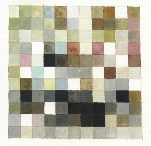
So if you stand really far away and squint, you can totally see Mumford & Sons in there…right?
Right?!
Here, I’ll do it for you:

SEE?! Mumford & Sons! I freakin’ told you!
~
~Sunday: CAROLS 91~
I had so much fun with Babel that I wanted to do another album cover. Seriously, I’d suggest any artist to try this–it’s so fun and relaxing, and an excellent way to practice mixing colors, too.
This time, I made the squares quite a bit larger so I could focus more on water color techniques. I also chose an album cover with a brighter color scheme to test my chops.
This time I used Ayumi Hamasaki’s CAROLS. Ugh she’s so perfect. ♥

And here’s Ayu (sort of) in all of her pixelated gory:

And just for fun, let’s compare:

Cool, huh?!
~
I had a lot of fun working on these. I think I stayed up (waaay) later than I should have, and I probably annoyed a few people on my Facebook page with all of the statuses and photos of my water color palettes I was posting. Eheheh. Sorry, guys.
So now that I’ve got watercolors under my belt, I wonder what kind of crazy shenanigans I’ll run into this week!?
Stay tuned to find out ♥